OPTUS
Optus project was called Spring Digital and we were on client side for 8 months. The team was consisted of 3 Senior UX designers (Jero De Vries and Simon Giles and I), 2 UI designers (Andrea Agathocleous and Owen Doyle), 3 Front-end developers (Shyam Bhadreshwara, Rich Field and Hoang Phan) and 1 project manager Damen Gilland
We had to re-design the current website and create pages for new features based on best practices.
We were assigned different tasks by Business analysts at Optus, and we had to take proper approach depends on each task.
NEW FEATURES ON MY ACCOUNT PAGE
Users have their telephone numbers in My Account and can configure them. Optus wants to add TV Set Top Box (STB) in My Account too, so all products can be seen in one place.
PAPER WIREFRAMING

To ensure that we have correctly understood the project, I sketched the requirement on a paper. It really helped us to have a better feeling of what problems are we going to solve.
In the Kick-off session with stakeholder we already knew some challenges and could clarify some points before hand.
COMPETITOR ANALYSIS
The next step for me was to check what other competitors are doing. So, I started looking at major Telco websites in Australia, Europe and US
I created a chart to show how each of those companies is treating the features that we want to implement.
BRAND GUIDELINES
No doubt that during the project, I reference the existing components in all wireframes and prototypes.
LIAISING WITH DEV TEAM
Time to time I had meetings with developers to keep them updated about the latest design and the components that we are using. It is a crucial part of UX design as you might sometime be able to use different variation of components that you don’t know and sometime a component that we had used was decommissioned. At top of it, Devs are better to be across the designs and confirm the designs are doable when goes to coding.
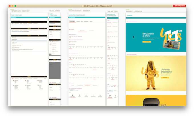
WIREFRAMING
The required tool for wireframing was Axure thanks to its versioning control and share functionality.
The approach was mobile first as due to the stats 83% of customers were using the mobile to access their dashboard.
USER TESTING
First step for me usually is Guerrilla or corridor testing. we booked a spot next to a café on Optus campus, and get a roll up.
I start usability testing with an intro about who we are, and what we are trying to do, and how we use this information in return for a free coffee!
How I perform user testing is task basis. I give one task to user and see how they perform, what are the drop-off points, what are the pain points. All these findings then go into my conceptual finding list
Then we asked the interviewees to perform couple of tasks and while we observe and take notes of pain points and drop-off points.
We used lookback.io to record voice and video for future checks.
RUNNING WORKSHOPS
Running workshops to ideate different scenarios and hear everyones thought on the problems we were trying to solve was the key.
Crazy 8s is one of my favourite methods to understand people’s visual thinking and mental models.
VISUAL DESIGN
at Optus we had dedicated UI designers ( Andrea Agathocleous and Owen Doyle) for final designs. To replace the component from the component library they needed annotated wireframe with component numbers. After visual design, it was time for front-end development. During visual design process, I’ve been doing QA checks time to time to ensure the design is 100% according to the wireframes.
A/B TESTING
Once everything was done and the page was live, I’ve been trying to get the conversation rate and heatmap from data analysts to check the drop-off points.
Then I proposed the second iteration of the design to improve the user experience. This needed to go live randomly or regionally. Then we compared the conversation rate to see if the change has a positive impact or not. If yes, we switched to design B.